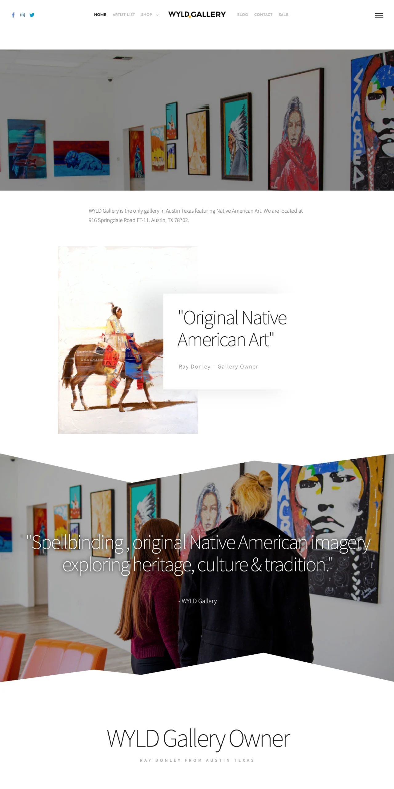
Before & Better: WYLD Gallery
The original homepage opened with a wide image and text, but the artwork itself — WYLD’s strongest selling point — was pushed further down the page. Visitors weren’t immediately immersed in the vibrant, authentic Native American pieces the gallery is known for. WPSimplifyd restructured the homepage to lead with the collection, creating a striking, shop-ready experience that celebrates Indigenous art and inspires action.
Before
Better
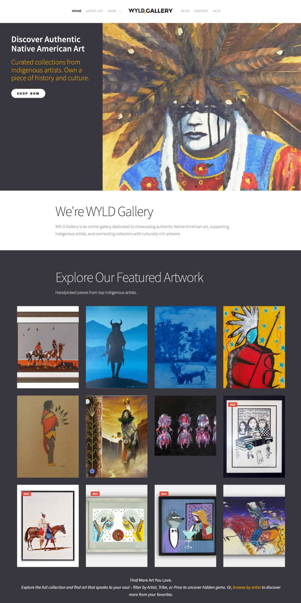
Improvements
WPSimplifyd made focused upgrades to boost visual impact and conversions:
- Lead with a high-impact hero image of artwork to create an instant connection with visitors.
- Added a clear, benefit-driven headline and subheadline that highlight authenticity, artist support, and cultural value.
- Introduced a prominent “Shop Now” CTA above the fold to shorten the path to purchase.
- Created a featured artwork grid that showcases a curated selection and encourages exploration.
- Balanced dark and light backgrounds to make the art pop and improve readability.
- Refined copy to focus on WYLD’s unique position and curated quality.
These updates reflect “Phase 3: Improve” in WPSimplifyd’s four-phase growth process: Maintain → Evaluate → Improve → Grow. The refresh was quick to launch and maximized WYLD’s most powerful asset: its art.