Before & Better: Beth Levine Counseling
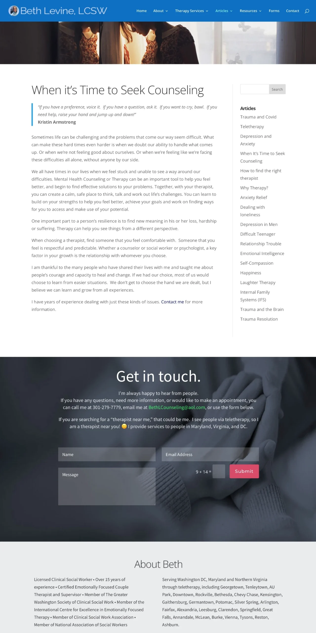
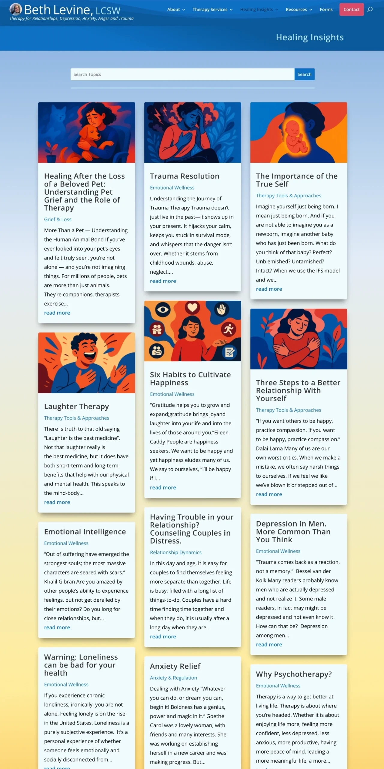
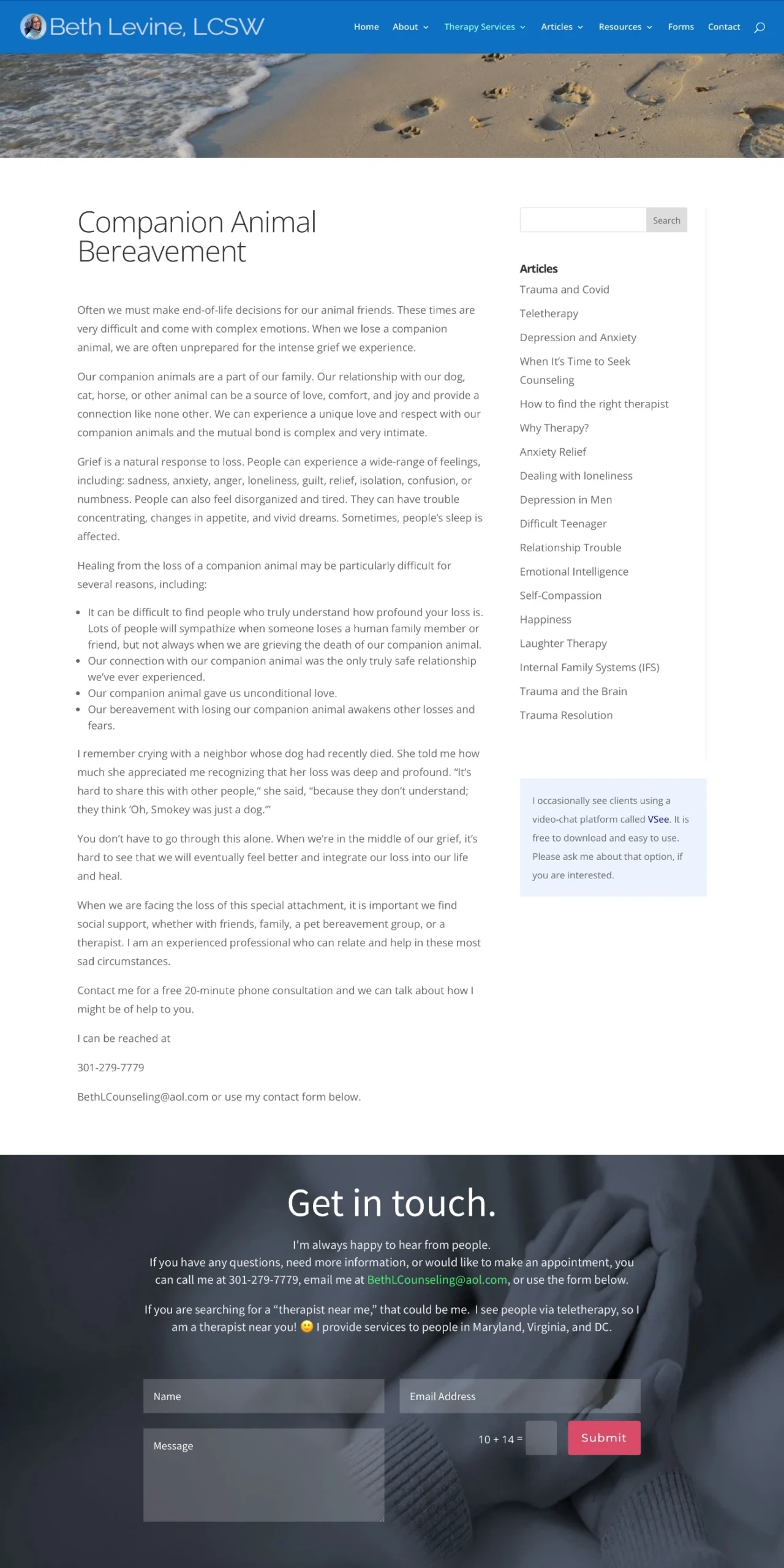
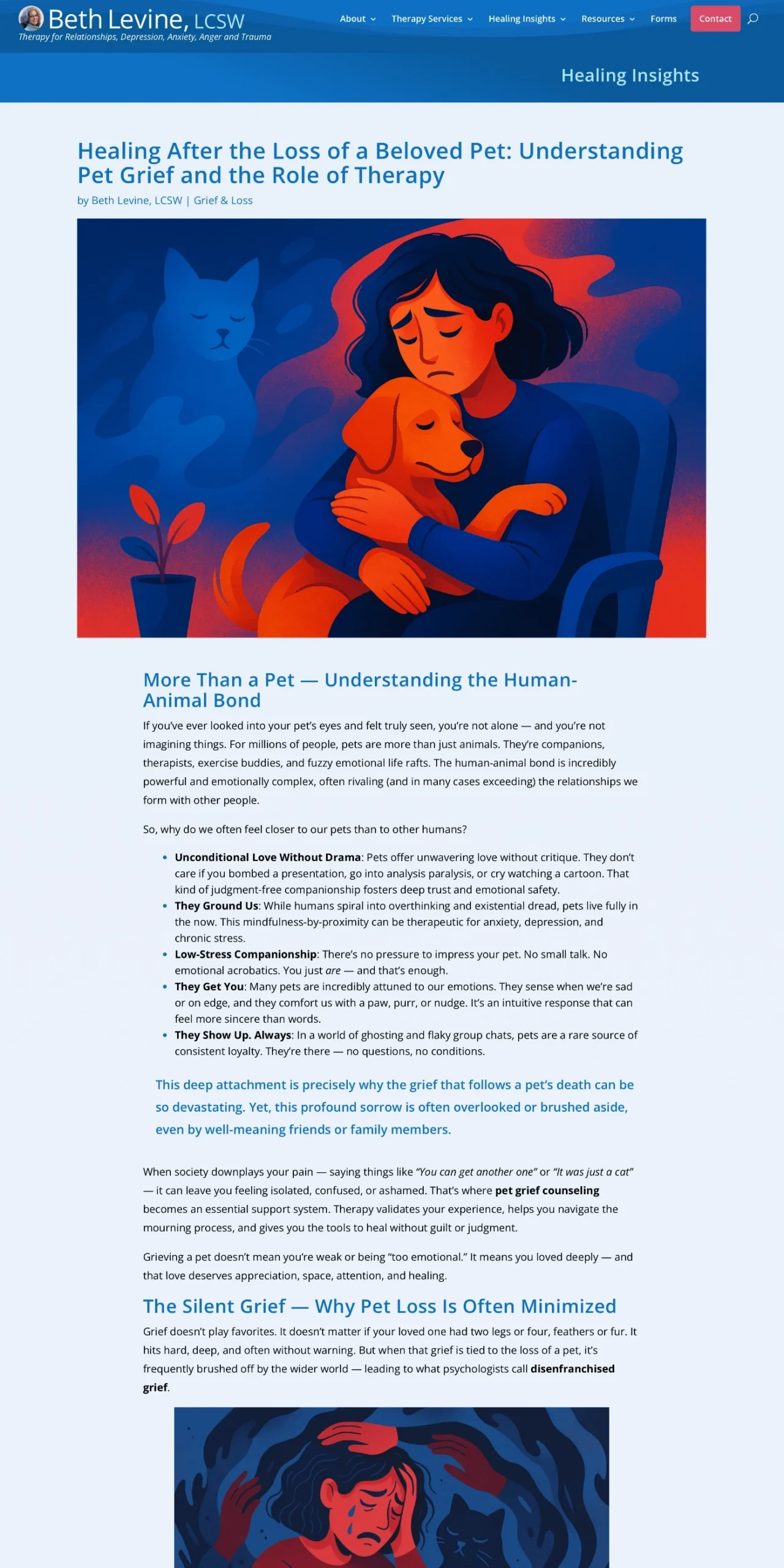
The original blog worked — but just barely. Walls of text made it hard to skim, explore, or engage with more than one post. Important insights were buried, visuals were minimal, and the experience didn’t encourage deeper browsing. WPSimplifyd rebuilt the blog using Divi, turning it into a clean, intuitive resource hub — complete with custom illustrations, smart structure, and stronger engagement.
Before
Better
Before
Better
Improvements
WPSimplifyd implemented targeted upgrades to improve clarity, usability, and reader engagement:
- Introduced a visual blog grid with bold, custom illustrations to draw readers into each post.
- Added clear topic labels and previews so visitors can scan and choose relevant articles quickly.
- Reworked single post layout with strong hero images, improved headings, and digestible sections for easier reading.
- Streamlined navigation by grouping posts under intuitive categories and adding a prominent search bar.
- Boosted cross-post discovery with enticing “read more” links to keep visitors engaged longer.
- Leveraged AI-generated artwork and refined copy to maintain brand tone while saving time and budget.
These improvements reflect “Phase 3: Improve” in WPSimplifyd’s four-phase growth process — Maintain → Evaluate → Improve → Grow. Working within Divi kept the redesign efficient and cost-effective, while dramatically increasing visual appeal, readability, and visitor engagement.


